Explore a selection of recent work here taken from my time being employed as a designer at Axminster Tools
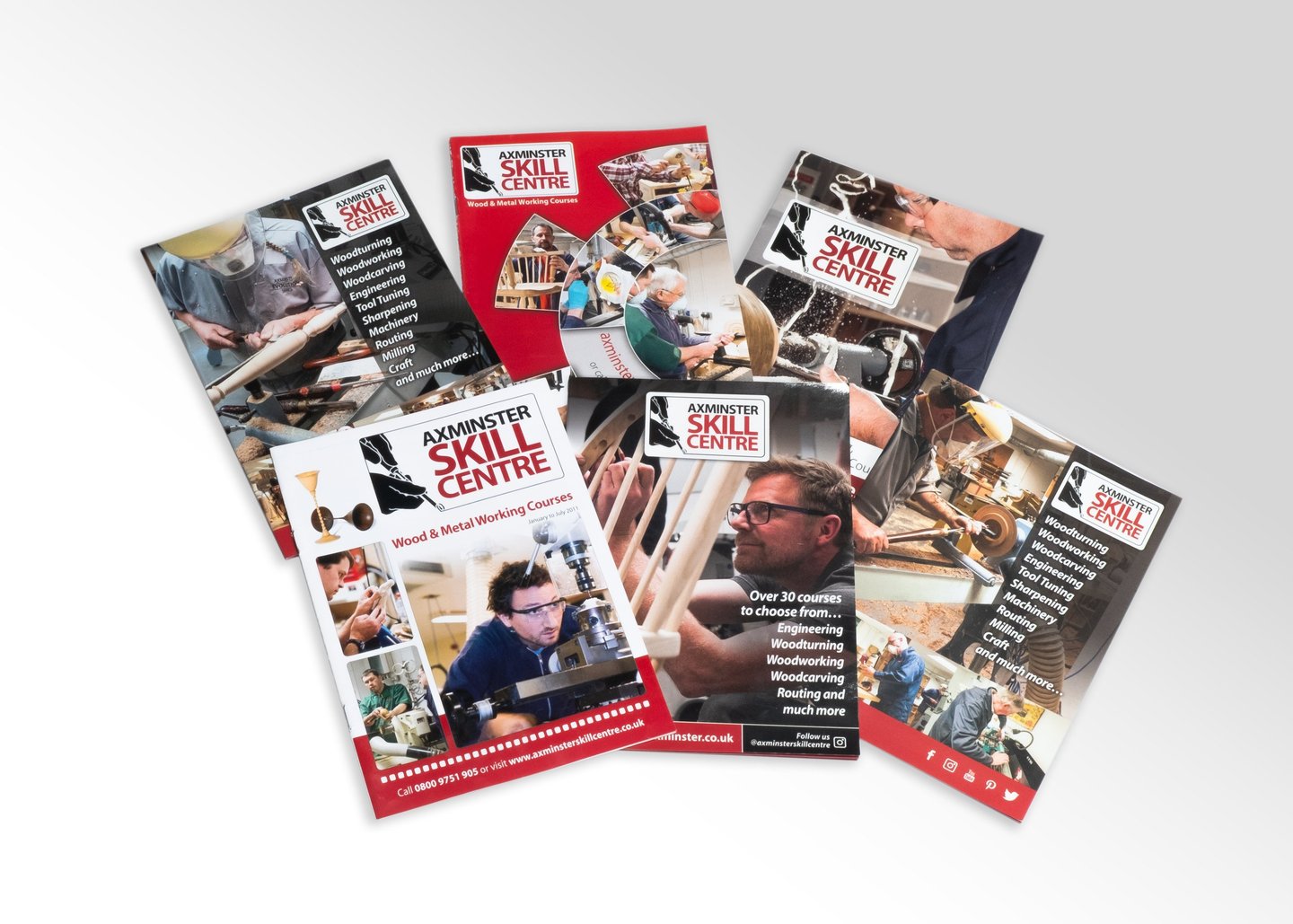
Print Work
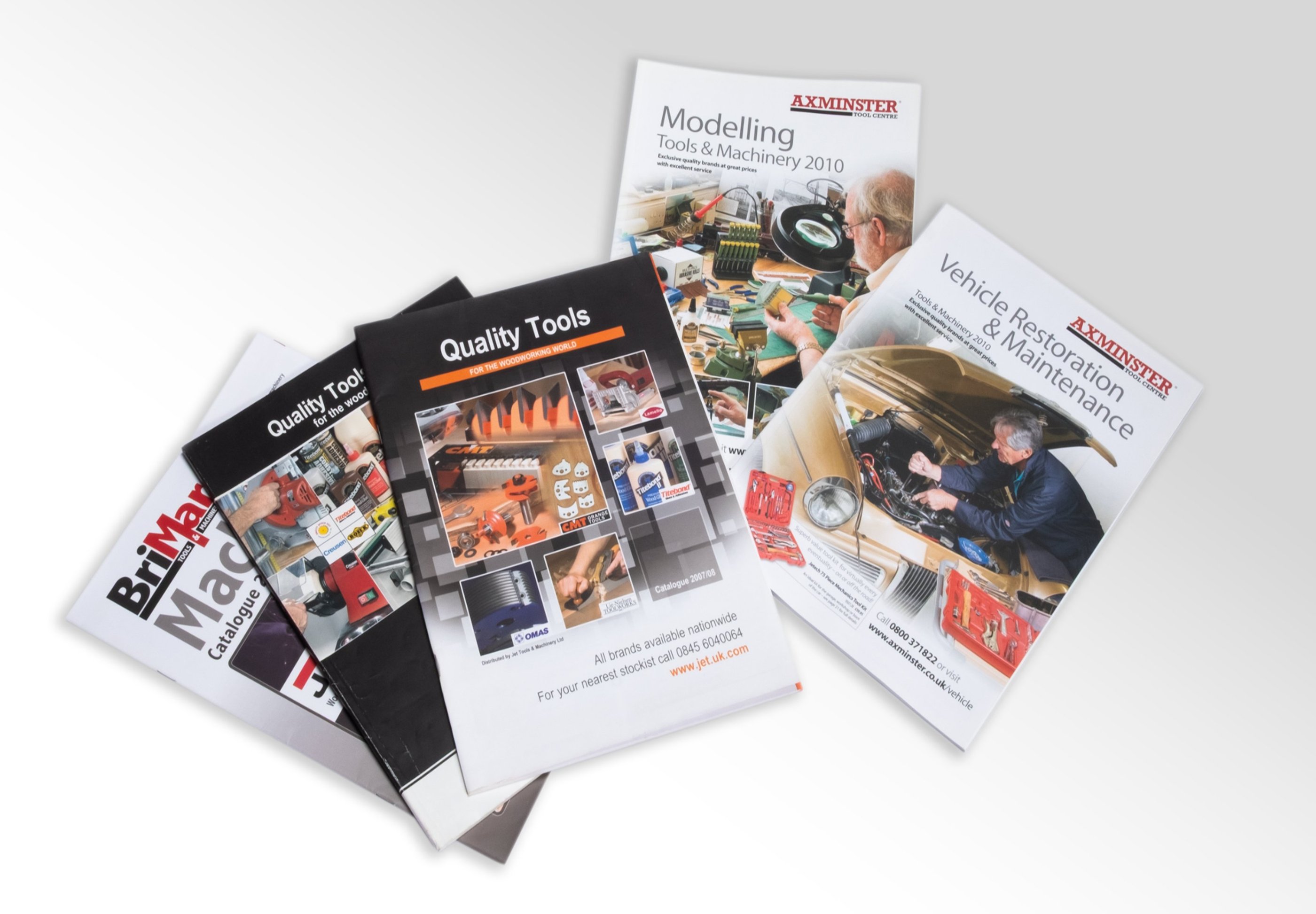
The task was... for the design, production, and management of core print materials, such as the annual catalogue and sales periodicals, to drive revenue for Axminster Tools. These publications served a dual strategic purpose: retaining existing loyal customers and acquiring new business through high-impact marketing. The key challenge was to accurately translate vast product information (thousands of SKUs) into visually compelling, brand-compliant layouts under strict deadlines
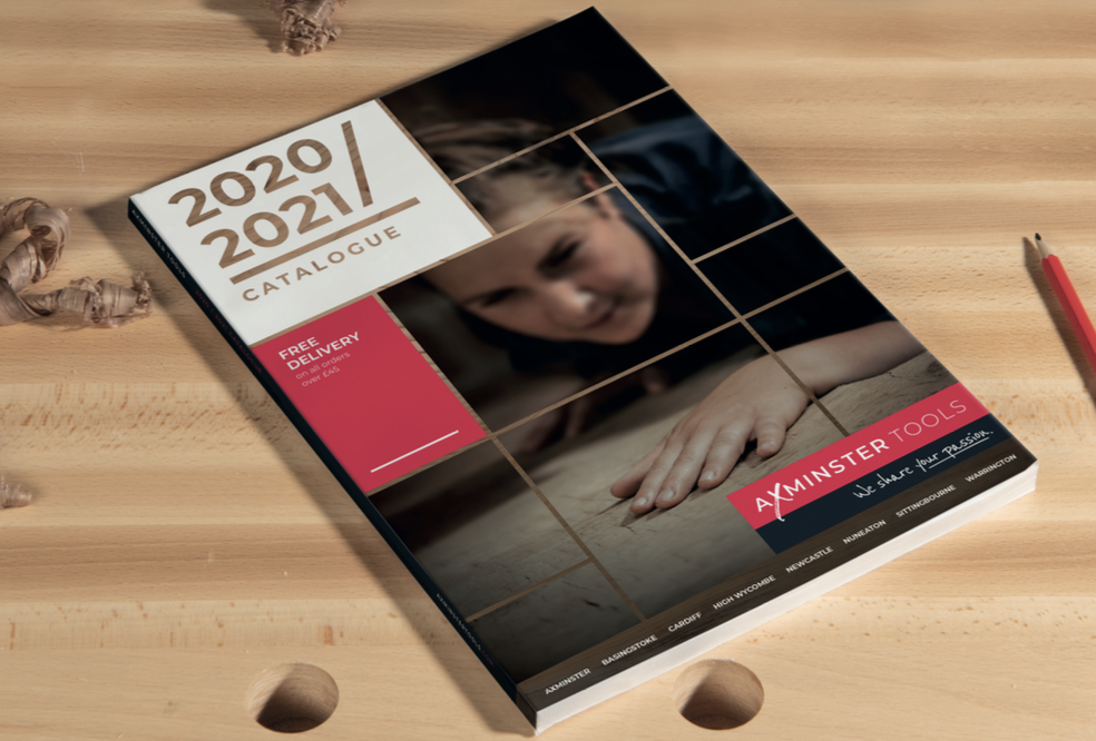
My Role was in transforming content into high-quality print-ready work:
I managed interpretation of product content directly from our central database, ensuring data integrity across layouts.
Responsible for designing product layouts, establishing a definitive style sheet and template system to give a visual consistency across all periodical runs.
Developed and implemented proofing process and manage external feedback.
Preparing and submitting final, pre-press artwork directly to the printers.
This extended to creating diverse publications, from B2C/B2B consumable guides to engaging, magazine-style product review journals.
Solutions and results
With processes and quality output directly contributed to significant commercial success and marketing reach:
Large Print Volume and Reach: At its most successful period, the main catalogue achieved print runs of 120,000 units, demonstrating its status as a high-value marketing and sales vehicle.
Diverse Marketing Portfolio: We successfully produced a dynamic range of catalogues and periodicals, strategically targeting various customer segments (B2C and B2B) and product types, from specialized consumables to high-value machinery.
Operational Efficiency: The establishment of robust templates and a clear production workflow ensured maximum efficiency, allowing for rapid turnaround on multiple publication formats.
Merchandise & Educational POS
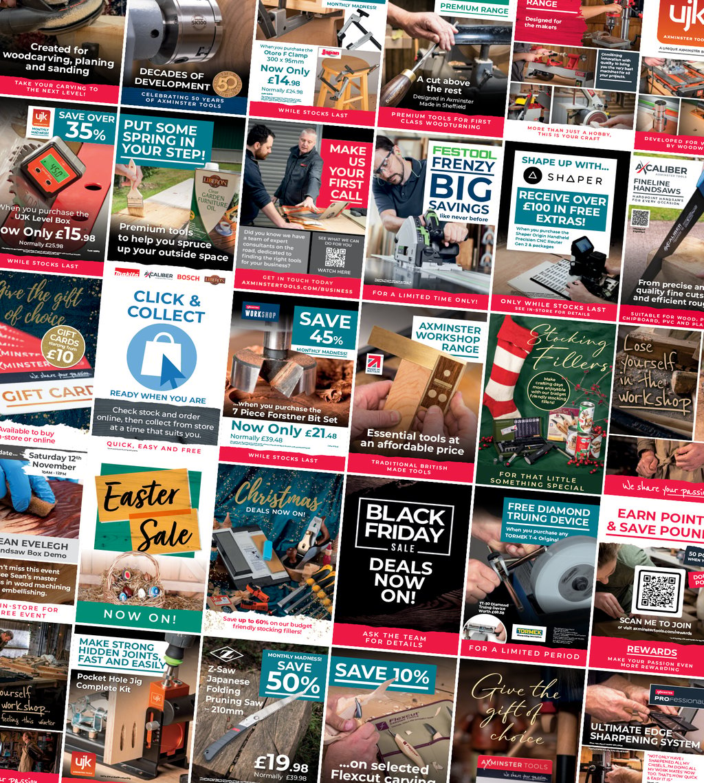
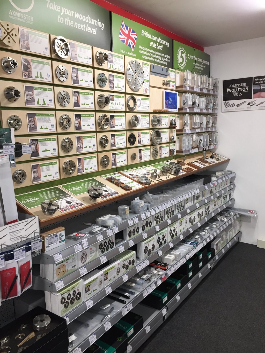
Challenge Was Brought… to modernise the in-store customer experience and drive better sales conversion through clearer merchandising. Our existing store communication was fragmented and confusing. The mandate was to design a unified visual system across all retail locations, convey product information, and empower customers to make a better, more informed purchasing decision.
How I contributed
I took responsibility for the design and development of template styles, establishing a unified own-brand Look and Feel that could be consistently applied across the retail side.
I was responsible for designing and producing point of sale assets, which were implemented to support merchandising for major product launches and new store openings.
A key element was the meticulous update and redesign of all Own Brand product signage, ensuring their elevated presentation matched their quality.
To support our international merchandising, I managed production of assets in multiple foreign languages, with brand consistency.

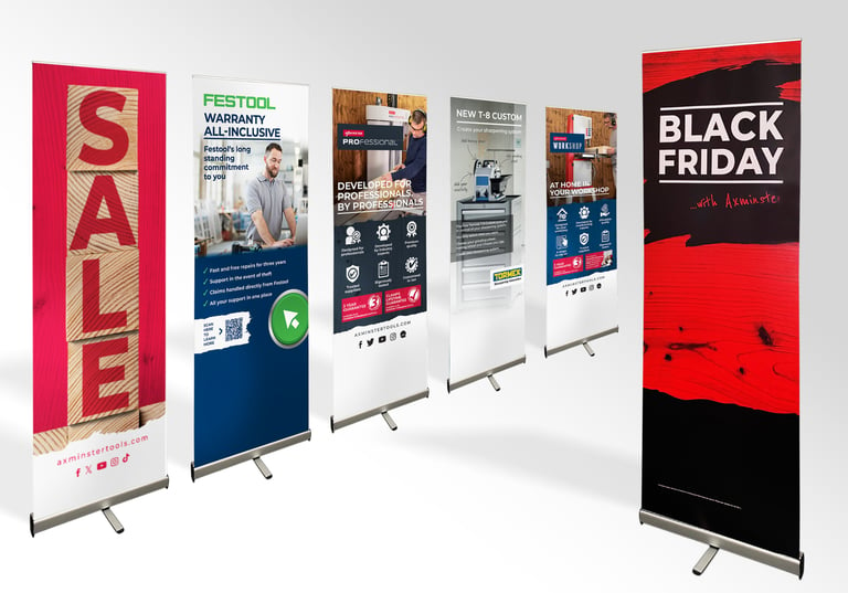
Solutions and results
Elevated Visual Appeal: Stores were transformed into visually engaging and spaces, enhancing the customer's shopping experience.
Unified Brand Communication: The tasks established a constant and professional brand look across the entire retail stores.
Improved Customer Navigation: in overall store wayfinding and product navigation.
Clarity and Digestibility: Complex product solutions and technical information were distilled into concise, easily digestible messaging, dramatically improving comprehension at the point of sale.
Multi-Platform Consistency: All promotional and informational assets (posters, signage, etc.) were designed in align with a new visual standard that was deployed across all stores.
Packaging
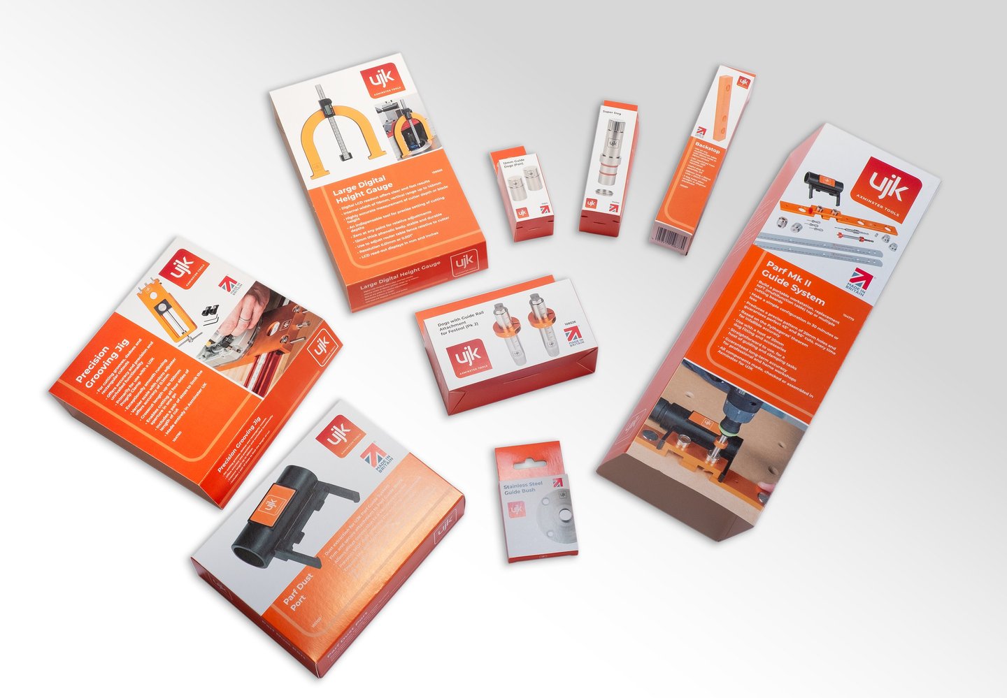
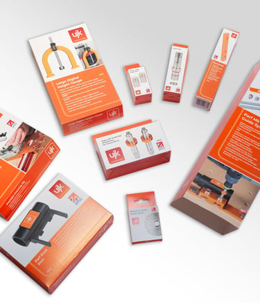
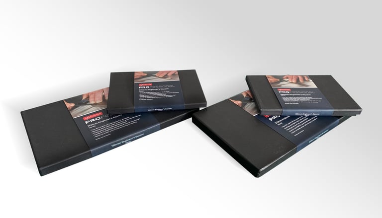
The challenge was... to execute an overhaul of our own-brand products packaging following a major logo rebrand. This update was essential to ensure visual consistency and market relevance across our range of products. This encompassed products developed and made in this country and those produced by our Far East manufacturing suppliers.
The successful transition required clear communication to prevent production errors and maintain supply chain momentum.
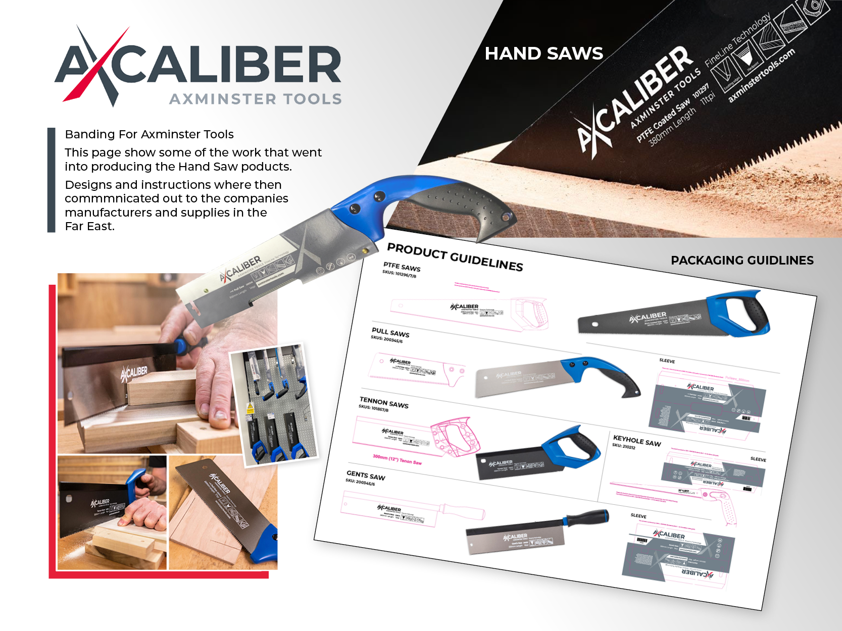
My role was in translating the new brand identity into a tangible, production-ready formatted across hundreds of SKUs:
I communicated and distribution of the updated brand gridlines, logo placement rules, and comprehensive artwork visual guidelines to internal teams and all external suppliers.
I was responsible for redesigning all product labelling and meticulously creating new, packaging templates to be print-ready, ensuring technical accuracy and brand compliance.
A key responsibility was to produce high-fidelity visual mock-ups of Axminster's own-brand machinery packaging, which were essential for providing clear, unambiguous direction to international manufacturing partners.
Solutions and results
The project delivered a fundamental upgrade to the brand's physical presentation, resulting in significant market benefits:
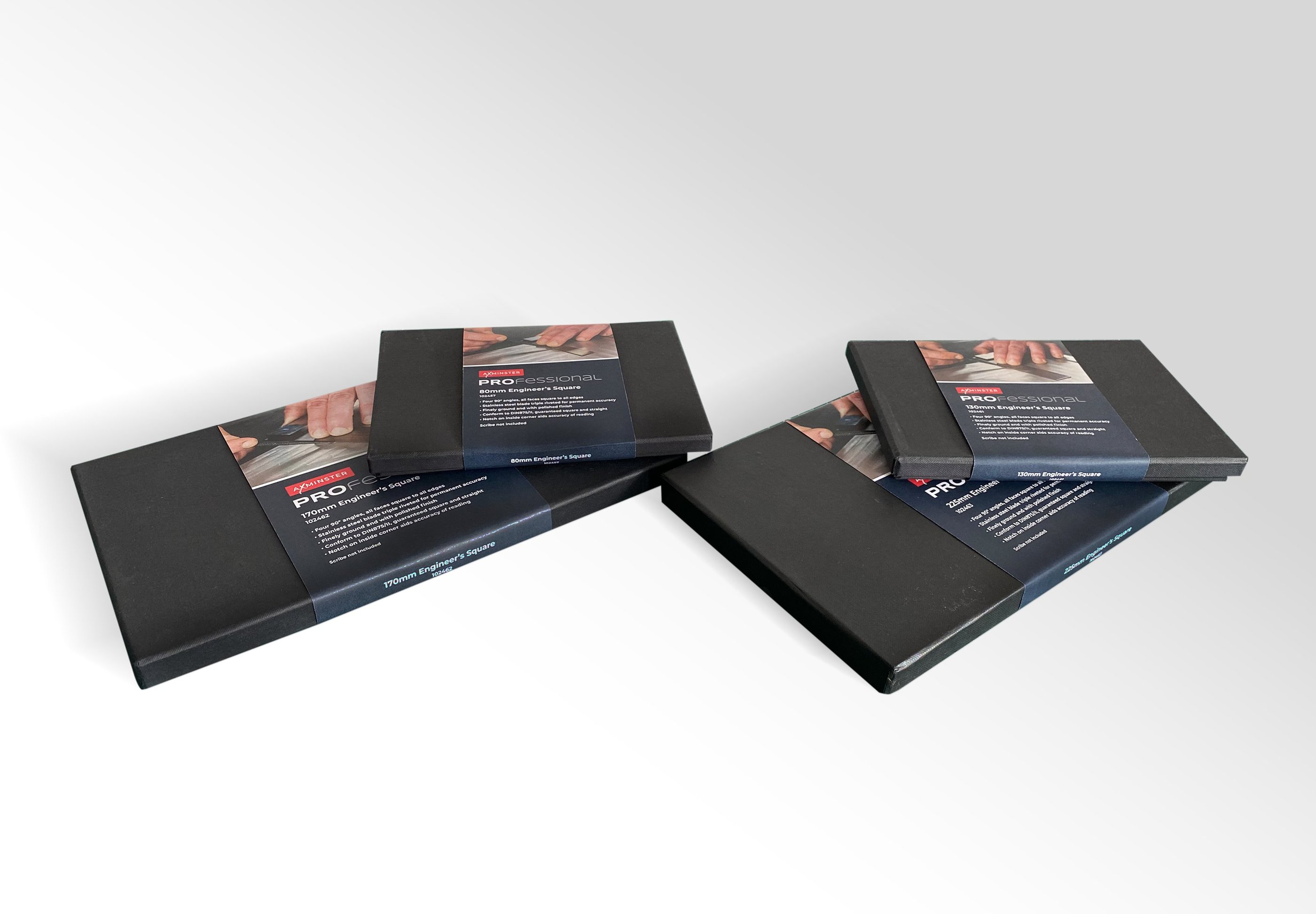
Refreshed, Consistent Aesthetic: We achieved a unified, contemporary, and professional look that was consistently applied across all machinery and the entire own-brand product portfolio.
Optimized Impactful Labeling: This redesign significantly improved product appeal for in-store displays, shows, and markets outside the U.K.
Brand Cohesion: The initiative successfully established a single, unwavering brand look across all product ranges, solidifying brand recognition and trust with the customer.

